 | 100% GROWN & SPUN IN AMERICA
Knitting Tips
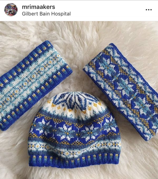
Fair Isle Color Layout – for Harriet’s Hat
Color is tough, because it’s as much personal preference as anything else. For Harriet’s Hat, Harriet picked out the colors of the Gilbert Bain Hospital and interlaced them through this beautiful design, adding pops of color here and subtlety there. Here’s what the finished project looks like, courtesy of MRI Markers. Notice the snowflakes are white and lighter blue, with a bright pop of yellow surrounding them.
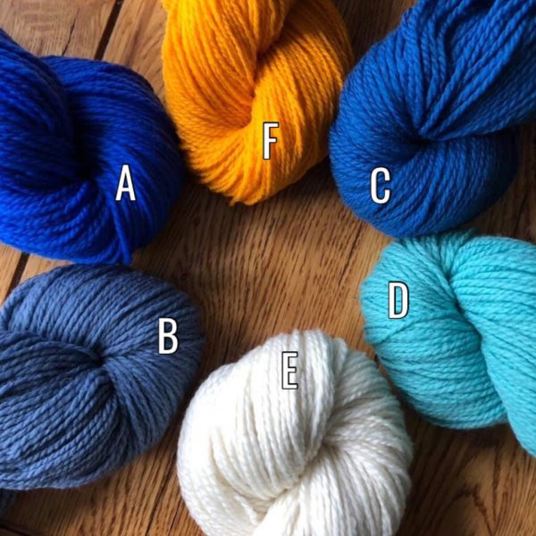
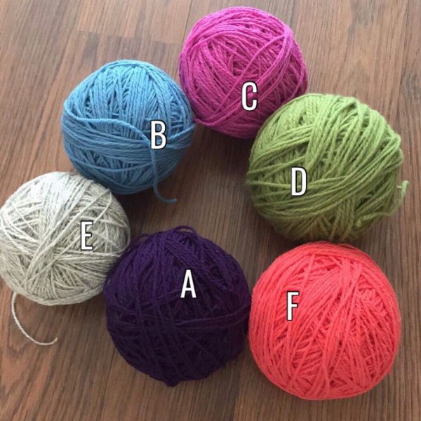
To translate these color values into a different palette, start with the original and label them according to the pattern.
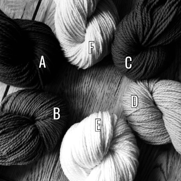
Next, convert your photo to black and white so you can see the tone of the color. In other words, you want to be able to arrange them from dark to light without worrying about ‘bright.’
For the original hat, A is darkest and E is lightest.
The three darkest colors come first, followed by the three lightest – but there’s a twist: darkest, third darkest, then second. Same for the lighter three. So far so good?
Let’s try some different ones then!
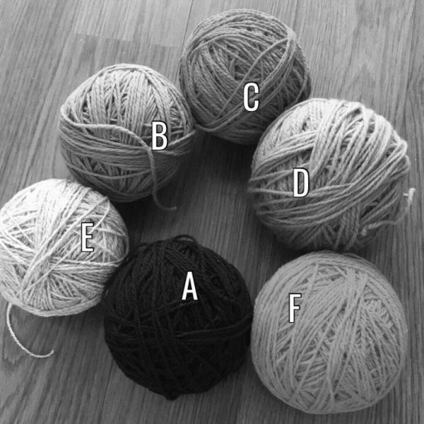
First, take black and white picture.
Arrange from darkest to lightest. Here, it’s A, C, B; then D, F, E. Yes, I did match the lettering to the original.
Now, it’s time to see them in color!
oooh! aaah!
Look at the original hat again to see if you like the placement.
The borders will be A: dark purple.
Blue (B) and pink (C) will round out the ribbing on the brim and the stripes on the edge of the snowflakes.
Chartreuse (D) will be where the aqua is: the center of the snowflakes and the smaller diamonds.
E (oatmeal) will be where the white is, it’s a nice light color for that.
Finally, the geranium (F) will be the center of the snowflakes and the speckles around them – where the yellow is now.
If that sounds good, great! If you want to switch a color, go for it. Say you like one particular color the least… swap it around so you see it less. In order of quantity appearance, you’ll use: E the most, A, B, D, F, then C the least.
Or you could work it backwards: I want the snowflakes to be pink on the outside (where it’s white now) and blue and green in the middle, so that means using pink for color E, blue for color D, then green for color B.
The possibilities are endless and each will make an outstanding hat.
It’s just a question of whether you like to see more or less of a color!
P.S. Thanks to K McCormick and Cathe W for the pictures…
we need to add pictures of your finished hats when they are done!